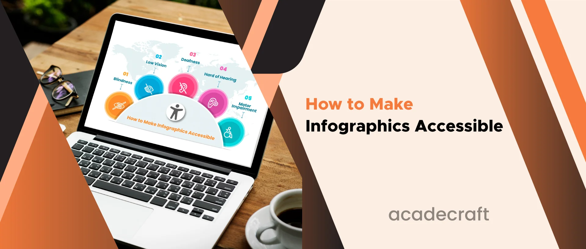
Infographics have become a powerful tool for transferring data in a visually engaging and easy-to-understand way. They are used across various fields, from education and marketing to journalism and data analysis. However, to ensure that infographics are truly effective, they must also be accessible to all individuals, including those with disabilities. Here, we will explore the importance of accessibility in infographics and provide detailed steps to make infographics accessible.
Accessibility in the context of infographics refers to making these visual representations of data and information perceivable and understandable for people with disabilities. It includes individuals who are blind or have low vision, those with cognitive impairments, and people with other disabilities that affect how they access and interpret information.
Accessibility is designing content and products to ensure they can be used and understood by all individuals, regardless of their abilities or disabilities. In the context of infographics, accessibility is essential for several reasons:
It's important to understand the different types of disabilities that individuals may have. The key categories of disabilities to consider include:
Blindness: Individuals who are blind cannot see visual content, including graphics and images.
Deafness: Deaf individuals cannot hear audio content like voiceovers or sound effects.
Motor Impairments: People with motor disabilities may have difficulty using a mouse or touchscreen, requiring alternative input methods.
The Web Content Accessibility Guidelines (WCAG) are a globally recognized set of guidelines set by the World Wide Web Consortium (W3C) to provide a web range, including infographics, accessible to people with disabilities. WCAG provides a framework for creating accessible content and is organized into four main principles:
Infographics should be delivered in a way that can be perceived by all users, including those with sensory disabilities. It involves providing text alternatives for non-text content, such as images and graphics.
Infographics should be operable by individuals with various disabilities, including ensuring that all interactive elements, such as buttons and links, are navigable using a keyboard or alternative input method.
Infographics should be designed in a way that is easy to understand. This concerns utilizing clear and concise language, organizing information logically, and providing user instructions when necessary.
Infographics should be robust and compatible with current and future technologies. It ensures that as technology evolves, your infographics will remain accessible.
Now that we have a solid understanding of the importance of accessibility and the guidelines, let's delve into the steps to make infographics accessible.
Selecting the right tools and software is crucial for creating accessible infographics. Look for software that supports accessibility remediation services and permits you to add alternative text to images and descriptions to other elements.
Use clear and easy tongue to make your infographic understandable to a wide audience. Avoid jargon, complex terminology, and ambiguous wording. Remember that accessibility is not only about physical disabilities but also cognitive and language-related barriers.
Alternative text, often called alt text, is a brief description of an image or graphic read aloud by screen readers to individuals who cannot see the visual content. When adding alt text:
High-contrast color combinations are essential for individuals with low vision or color blindness. Ensure that text and graphics contrast sufficiently against their background to make them easily distinguishable.
In addition to the visual infographic, offer a text-based version of the content. It can be a captioned summary or a linked document that provides the same information in a textual format.
Ensure that all interactive elements in your infographic can be navigated using a keyboard. Test your infographic by tabbing through it to ensure all elements are accessible without a mouse.
Charts and graphs are common in infographics. When creating these visuals, consider the following:
Provide a transcript of the audio content if your infographic includes audio elements, such as a voiceover. It ensures that individuals who are deaf or hard of hearing can access the information.
Regularly test your infographic for accessibility using various tools and assistive technologies. It will help you identify and address any accessibility issues.
Accessibility guidelines and technologies evolve. Stay informed about the latest developments and update your infographics to ensure ongoing accessibility.
To illustrate the principles and techniques discussed above, let's look at some accessible infographic examples:
In this infographic, the following accessibility features are implemented:
This infographic about the impact of climate change incorporates accessibility elements:
Creating an accessible infographic is not a one-time task. It requires ongoing testing and evaluation to ensure that accessibility features work correctly. Here are some key steps in the testing and evaluation process:
Test your infographic using popular screen readers such as JAWS, NVDA, or VoiceOver to ensure the content is accurately conveyed to users who rely on these tools.
Verify that all interactive elements can be navigated using a keyboard. Use the "tab" key to navigate your infographic and check for logical order and functionality.
Use accessibility testing tools or online contrast checkers to confirm that your color choices meet the contrast requirements, making text and graphics readable.
Perform usability testing with people who have disabilities. Collect feedback and make modifications based on their input to enhance the overall user experience.
Use automated tools and manual checks to verify that your infographic complies with the WCAG guidelines and any relevant accessibility regulations in your region.
Bonus Read: Basics of Color Contrast in Web Accessibility
To summarize, here are some best practices for creating accessible infographics:
Infographics are pivotal in conveying information quickly and effectively. However, to fulfill potential, infographics must be available to all people, regardless of their capabilities or disabilities. By adhering to accessibility guidelines, implementing best practices, and promoting a culture of inclusivity, you can create infographics that are truly informative and engaging for everyone. Accessibility is not just a legal obligation; it's a commitment to equality and the universal right to access information. Make your infographics accessible, and you'll make the world a more inclusive place for all.
Share