Corporate eLearning design isn’t something that everybody gets. It is a content mechanism through which many can learn and continuously improve. Even if you think it has no use in the structural adaptation of your organization, corporate learning techniques have enhanced the overall training programs.
The digitized convenience and easy-to-apply tactics make eLearning very easy for people who want to grow in their careers. But, from a company’s standpoint, how do you even get started with something so broad and personalized simultaneously?
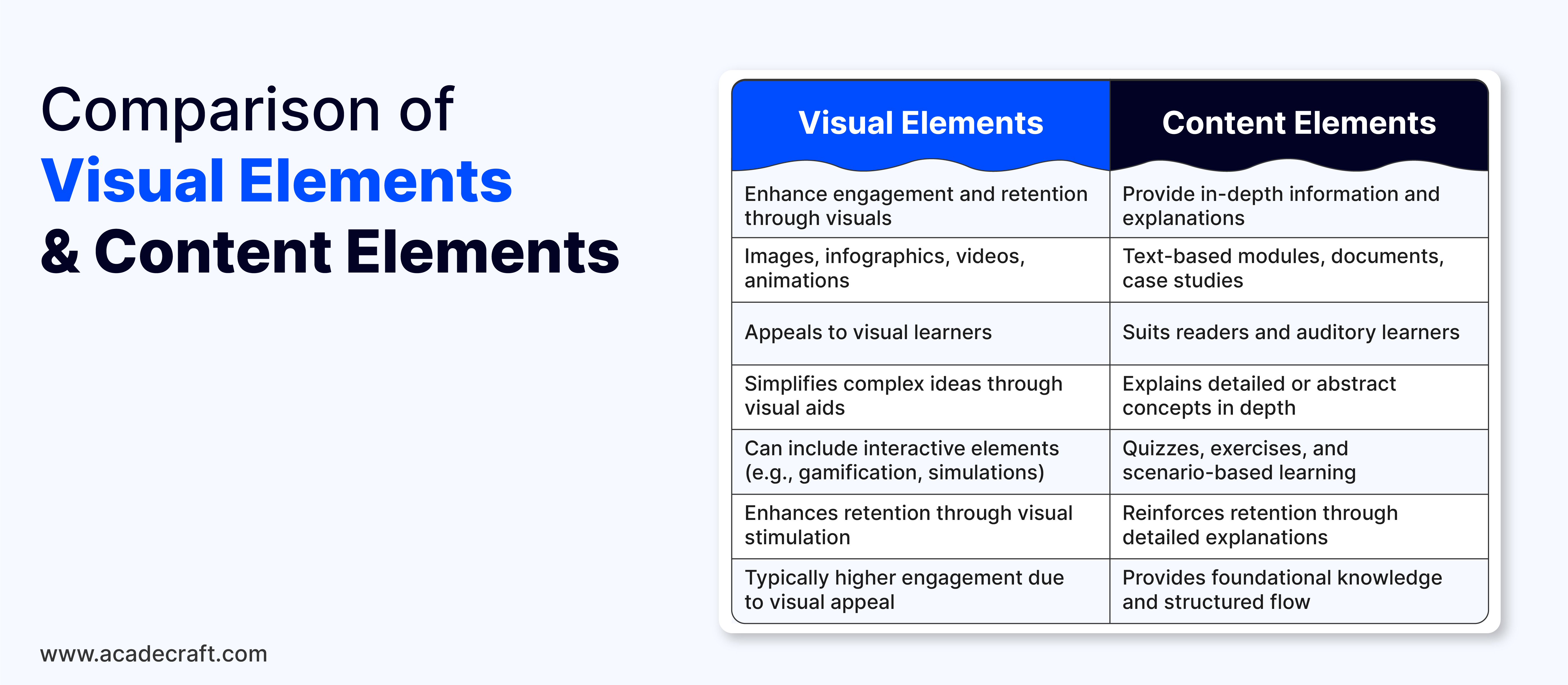
Let us guide you through the big bold map, which is corporate eLearning design, and help you understand the basic visual and content elements. These can be implemented to create a starter-level eLearning design for your business.

You need to combine visual and content elements to upscale your training and learning programs for many reasons. But, sometimes it's better to know and acknowledge everything before you make a decision. Here are some reasons why you should consider visual and content features you should consider:
There are many new and creative visual concepts up in the air right now, you can easily strive for better and broader learning experiences. Here are some visual cues we think are appropriate and scalable:
To make sure everyone in your organization/business understands how important corporate eLearning development is, you can visually brand everything according to your goals, color schemes, and styles. You can customize visual achievements and certifications to reinstate trust and constant growth, while also promoting your practices at a much higher level.
You can take inspiration from your company’s logo, colors, and fonts to use throughout the e-learning modules to create a cohesive and professional look. This will make sure any new joiners also understand the core brand objectives as clearly as possible.
Any interactive element automatically elevates the user experience. You can put short animations or clickable images, which can easily improve your engagement significantly. Make sure that these designs have cohesion and work properly cross-functionally. It may also be better if subject matter experts suggest the contents of these images/videos.
You can also use a carousel of images to explain and expand on particular concepts, like processes. These will be visually appealing to a number of learners and encourage self-participation in the form of interactions and social discussions.
A book without any color or illustrations seems incomplete. Similarly, corporate eLearning design is not visually satisfying until it accommodates some images, icons, or illustrative material. These are relatively small visual changes, but very crucial to make multiple concepts fit snugly but in a streamlined manner.
These can also be used to break up text-heavy content and help visualize key ideas or steps in learning modules. For example, if you are explaining difficult medical processes or protocols to healthcare workers, visual depictions of medicine-related topics will be more impactful.
Just like images and icons, videos and animations can be a better way to present bulky content in an alluring way. Videos of 5 to 7 minutes or less are enough for most learners to grasp the summarized or overall message the texts might be trying to convey.
Using animated gifs in between text slides can also help you encourage the user to carry on lessons on a daily basis. These practices can help in creating variations about subject matters that trainees might already know about.
In an overall learning or training course, you can easily gamify some elements, which you think can benefit from such a change. Most designers of such eLearning courses may suggest you some progression-reward techniques to implement. This favors the learners the most, with rewarding validation.
Also Read: 5 Effective Ways to Use Gamification as a Teaching Strategy
You can also use badges, progress bars, or leaderboards to create a sense of achievement and motivation across anyone. This can also have an indirect effect on people to compete with each other, which will just increase the engagement and output better.
Quizzes, surveys, and other similar formats can be a great way to generate user data from your learners. These can give you a great idea of how well people are responding to the entire learning design and if any future improvements are required to be implemented.
There are some common ways, such as visual quiz formats with multiple-choice options, drag-and-drop exercises, or surveys to make your learning module unique and customized to your own preferences.
A dynamic design can help you create a great environment for learners across many platforms. This cross-functional support is very important as e-learning is highly accessible from many different devices and platforms. Some common devices include desktops, tablets, and smartphones.
You can increase the software's potential to be smooth running without any lag or drag and to follow faster loading times. Also, the implementation should be easy and user-friendly.

The content follows a close lead after visual enhancements. After you have unleashed your creative freedom, you can focus on making the contextual text as close as possible to the goals and objectives. Here are some concepts you can borrow:
Finding what you want to convey in the learning program is the very first step. Objectives, like navigating the company’s systems, understanding the corporate culture, and identifying key organizational policies. Clearly stating the expectation at the beginning of the module and then directing the learner the correct way, can reap great results.
You can make sure that every objective is completely aligned with the company’s vision and goal. Also, these have to be practical and acquirable skills that can give you quantifiable results to later use.
One of the most common ways to engage and gain their trust is to implement scenario-based learning. As these are digitized simulations or they also can be in a video format followed by questions, give learners the space to make mistakes.
This is extremely important to instate a sense of trust and believability in actual situations, where the person will be less likely to make the wrong call. These can also help in building tolerance in people who might lack patience, especially regarding customer service.
Breaking up big subjects into smaller, easy-to-understand lessons is known as microlearning. It usually contains short videos, audio podcasts, screencasts, downloadable resources, or interactive simulations that are 3 to 5 minutes long.
These help people consume a lot of data but in a more efficient and manageable way. This is especially useful in a corporate training setting, where people may have less due to other demanding commitments. It is also great at helping people to concentrate on one key topic at a time, enhancing their retention rates and learner focus.
To make the course measurable and evaluable data is made possible with assessments and checks. You can use regular quizzes, knowledge checks, or assessments to reinforce learning and measure learner progress throughout the entire course. Insights into the learner’s mind and mannerisms become easy to perceive.
These interactions can also provide exposure to trainees who might lack the prowess in some areas to seek help. Instructors can also easily provide their tips and feedback to people directly and start meaningful discussions.
Any data that can come in the form of feedback and recommendations can only provide you with better results for the future of your business. Near-instant feedback on quizzes or activities can help you understand their effectiveness and provide personalized learning paths or recommendations.
Based on a learner’s performance, you can learn about their own experience with the software to improvise as you go. This will help in real-time refinements, so new employees don’t have to learn redundant information or outdated policies.
Storytelling can be a powerful tool in explaining concepts in a fun way to any learning preference individual. Storytelling is much more impactful when done with content as certain use of vocabulary and literature can make the person connect on an emotional level.
You can also use storytelling to make the content more relatable and engaging to the person with a human touch. Try to include narratives that feature characters facing real-life challenges to help learners connect with the material even more deeply.
This is an absolute must for people who want to make their material as successful as possible. Some users might not have the resources to access corporate learning solutions. So, if you can provide the content in other formats, like downloadable PDFs, it can be useful.
Other resources, such as cheat sheets, guides, or worksheets that learners can refer to outside of the e-learning environment for ongoing support. Also, try to convey to your employees that they can contact you for any doubts, regardless of whether they have this reassurance or not. More open communication can always help foster positive habits.

Even though we can provide you with more tips, tricks, and suggestions, end of the day, years of experience in a particular field is unmatchable. Also, you might not have the time to cultivate learning solutions for personalized training. So here are some reasons, why you should trust experts, like Acadecraft:
Every corporate organization is unique with very broad perspectives and goals about the future. So, it becomes very important for people to understand how big of an impact some visual and contextual material can make. An effective corporate eLearning design can make or break the structure of your organization.
To ensure you are doing things right, you can definitely employ the above-mentioned graphical and content-related elements to make sure you can make a basic e-learning design. If you aren’t sure about pulling this one off by yourself, you can use the help of many reputed corporate learning companies, like Acadecraft to promptly bring discipline and togetherness to your training and onboarding programs.
Share